



Theming and customizing a landing page
The LMS has many options available to administrators for customizing your pages and themes locally. Several portal administrators have harnessed this to make their LMS more personalized for their student's needs and to keep things more aligned with their internal branding.
Presentation Options
Course folders and the course library can be presented in list format or tile format. By default, it is set to list format with the icon and title side by side in an ordered list. If you wish to have the folders or courses present in tile format, you can change the presentation under the settings.
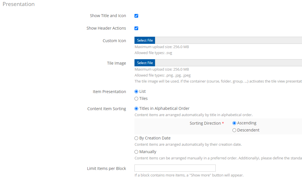
 Figure 1. Presentation section under the settings tab
Tiles
If the presentation type is set to tiles, admins can add images for the tile background. This would allow the user of custom graphics to denote collections or courses. Titles and descriptions will show below the card. See below:
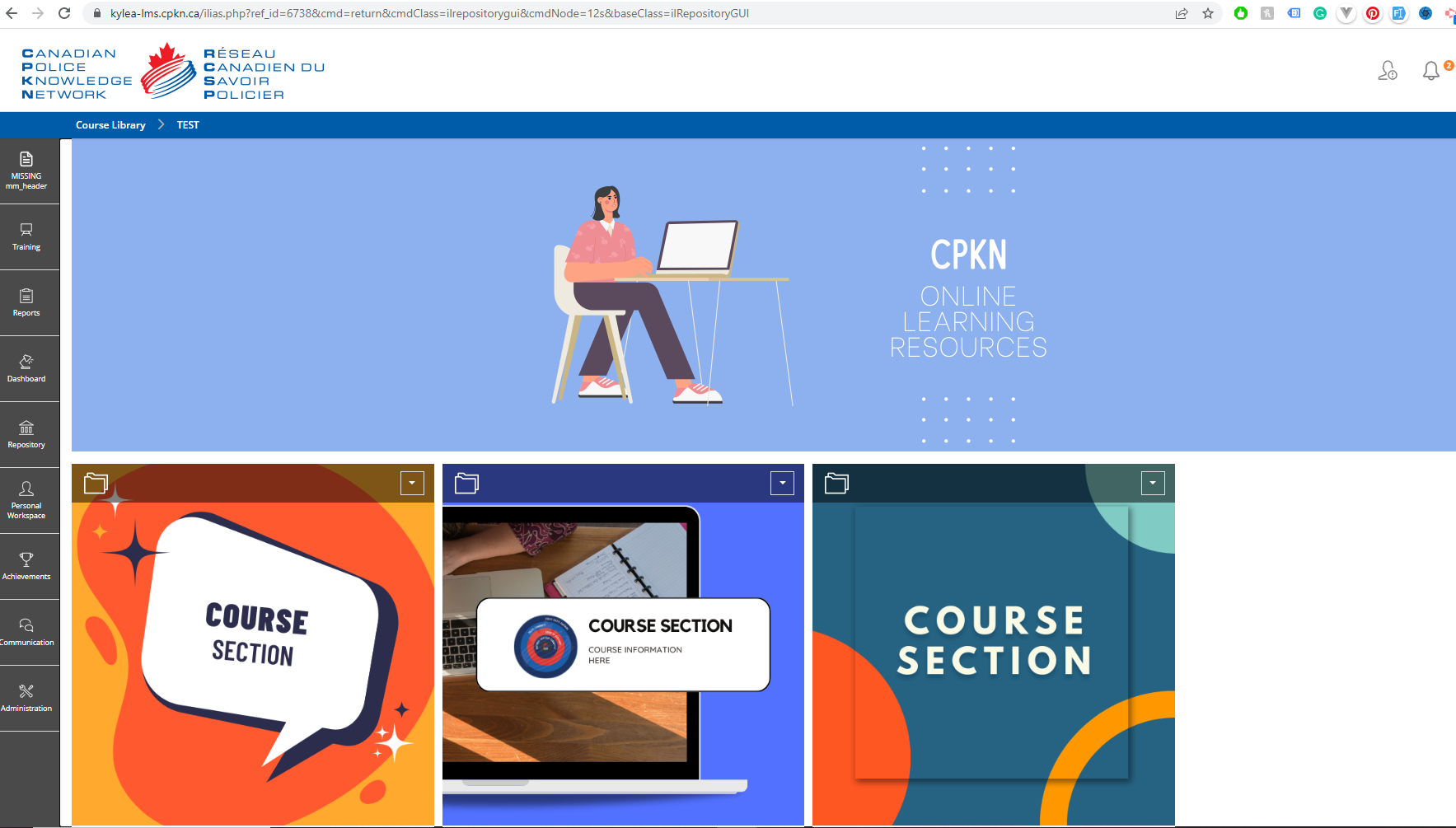 Figure 2. Course folder with tiled categories
Admins can also add course sections in resource lists so they are sections of courses, This allows courses to be split into sections and they can be set into columned layouts. This would allow additional sections to be added with them like text or media.
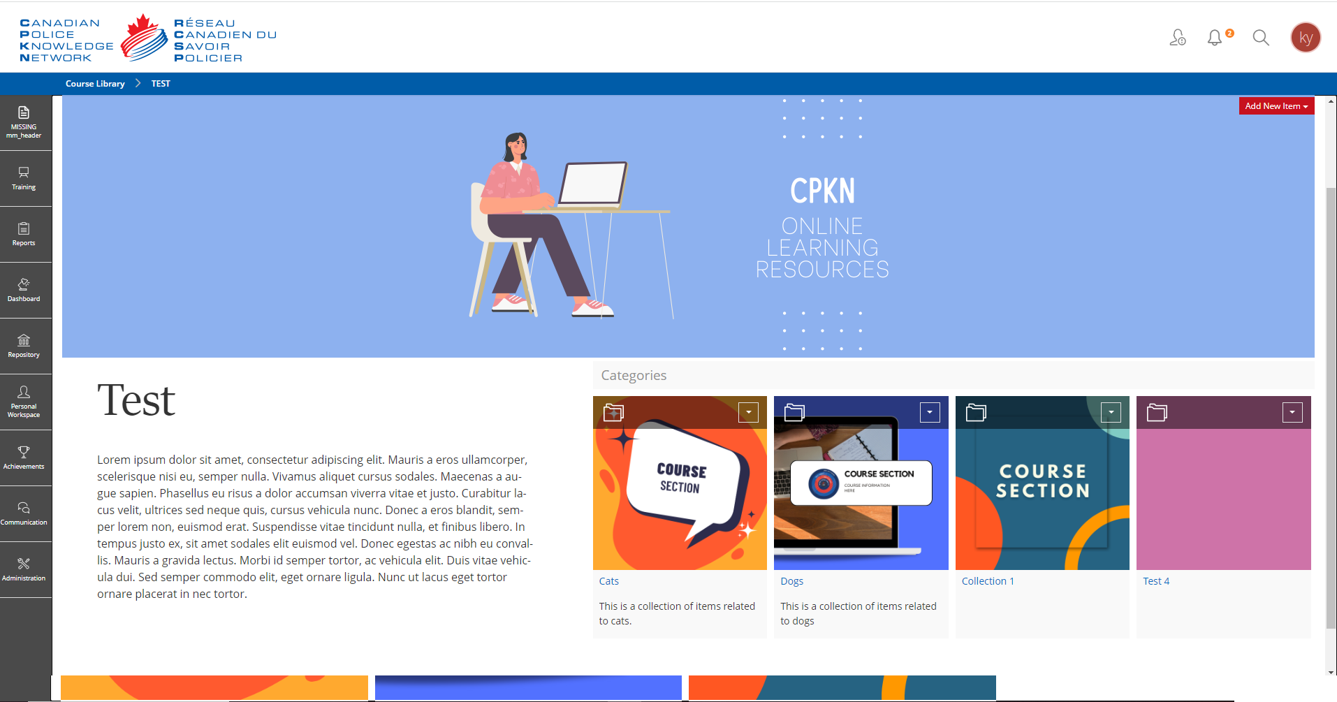 Figure 3. Resource list and text in a column layout.
Custom Content Styles
On these pages you will notice a custom section used as a header and custom text settings. These are also available to admins under the Administration-> Layout and Styles section in the Content styles tab.
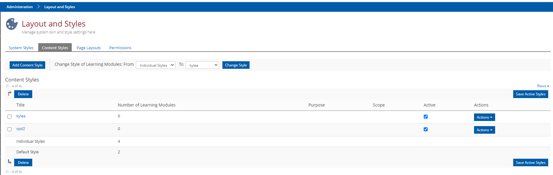 Figure 4. Content style
 Under this section, you will see all the existing content styles that are on the LMS and you have the option to add, edit and delete. If you want to change all sections of the LMS to a custom option (this is a fast way to change all standard text styles etc) there is an option at the top that lets you select what existing style and what the new style will replace it is.
- Text (Block)
- Text (Character)
- Section
- Link
- Table
- List
- File List
- Media
- Accordions and Panels
- Question
- Page
- Glossary
- SCO and Objective
- SCORM RTE
Text (Block)
Under the text block section, you will have the option to edit existing styles and add your own that can be added on page editing. This is a good place to add margins and padding to paragraph text, create call-out text styles, change text sizing and font families, and edit the built-in text blocks and separator styles. In the above examples, there is a custom font family and size applied to the header text, and on the paragraph (standard) text there has been a custom line height set, custom padding, and the sizing has been increased.
Sections
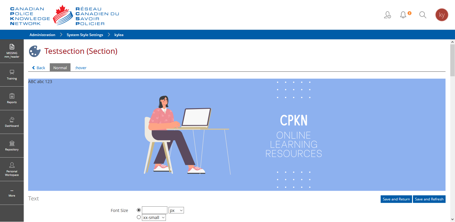 Figure 5. Custom section style
Sections can be useful for admins to build headers or call out text areas on a page. This can be achieved by either creating a banner image and setting it to the background file and adjusting the placement (setting it to fixed if you would like it to parallax), and setting the minimum height requirement. The section will give you a preview of what the banner section you have created looks like.
You could also create a section that just has a coloured background and set a text section and/or a media on top of this. Once the custom section style has been saved, you will have the option to apply it when you add a section when editing a page (ensure that the style is set to what content style that section style resides in or you won't see it as an option). Set your block style to the custom style you created and you should see the desired results once you save your changes.
Feel free to explore these other sections and see what options are available to you under them. Each section will give a preview of what the item looks like so you can visualize changes before applying these to page layouts.
Layout Tutorial
In this tutorial we are going to build on the above information to help you build out a landing page with resource lists, tiled courses, columned layouts and custom text.
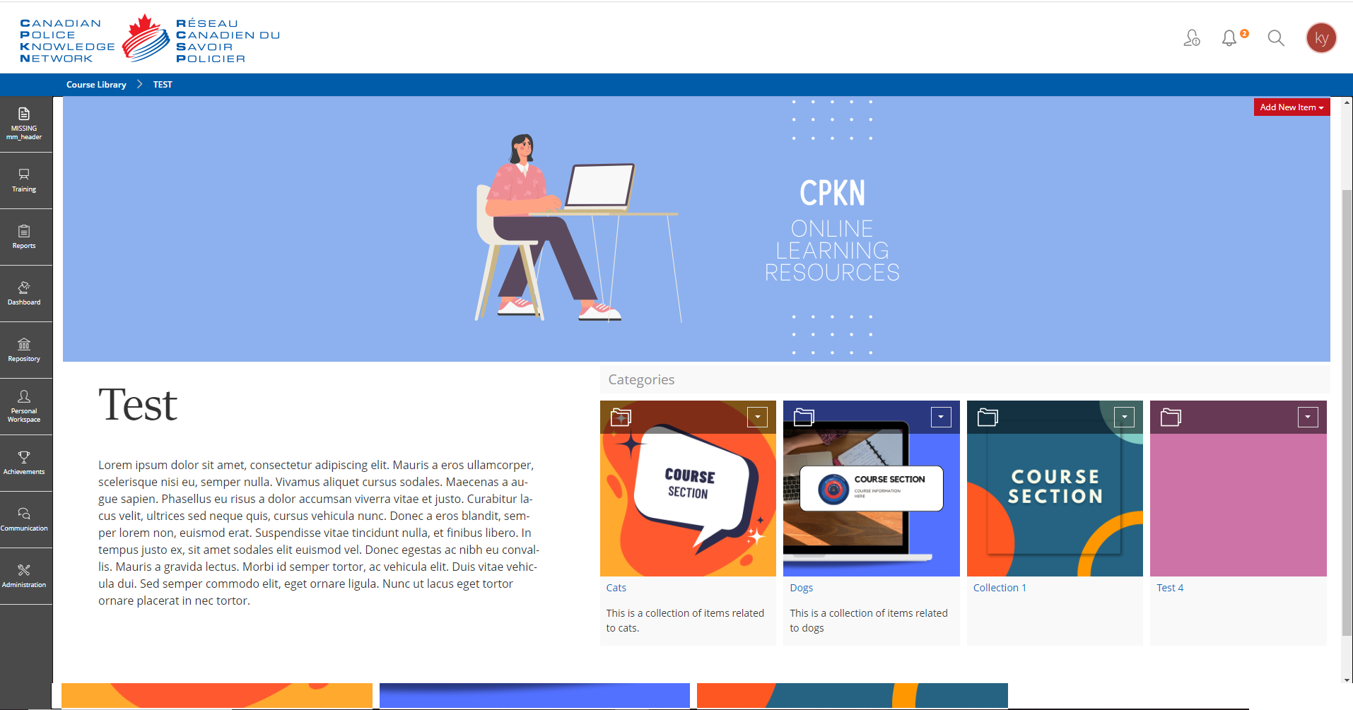 Figure 6. Resource list and text in a column layout.
Step 1
Firstly, let's start by making our custom styling elements so that they are ready to be added to the page when we start customizing things. For this example, we are going to need to build a section that will be acting as a header, a custom paragraph, and a custom header text for the "Test" text. Should you wish to add custom images for the tile cards you can also add those. If the images are the same sizes you will get a nice row of images as seen above but if the images are different dimensions from each other the cards will grow to accommodate those, which can throw the look of your layout off.
To build out a custom content style, navigate to the layout settings as noted above. If you currently have a custom content style that you are using, do your additions in there, or add a new style if you are just starting. We will start with the heading text
Heading Text
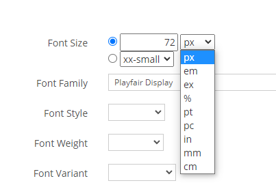 Figure 7. Font options for text block
To build this heading we are going to first click the "Add Style Class" button. Give this new style class a name that will help you denote it later when you want to use it eg, "CustomPageHeading". Once you click save you will see the "Added style class" message and the styling options available to you. For this heading, we are only going to be changing a few options. Firstly we want to give this text heading a larger size to set it apart on the page. In the example, I am setting the font size to 72px. Make sure the radio button beside the number selection is set unless you want to use the preset sizes drop-down. You can set the units to what you see in the drop-down. If "pt" is easier for you to envision as it is what word processors use, use that unit. "px" here denotes pixels. For font family, I am using the google font "Playfair Display". If you have any custom font families installed, you can set them here if you would rather have another font.
The only other style we will need to set for the heading in this tutorial is some padding and margins to add some visual white space on the page. Padding is applied inside a container and margins are applied to the outside of a container; This is easier to visualize if you set a background colour on your text block should you wish to experiment with padding and margins. For this example, we are going to set the top and bottom margins to 10px and we are going to set the padding top and bottom to 10px as well. For the left and right padding, we are going to set 50px to both. Hit save on your styling changes and you will have a new heading you can use on page customization. You will see a preview of what this heading looks like on the styles page.
Paragraph Text
For the paragraph text, you can either choose to edit the "standard" text block that is given or create your own custom text block again. This would depend on if you wanted to use this style sparingly or apply it universally to standard text blocks on pages set to use this content style. For the example above the changes I've set are 16px for the font size, Line Height 150 %, this just makes the equivalent of 1.5 spacing between lines of text which adds a bit of visual white space and makes things a bit easier to read (the same is set to this paragraph you are reading!), and we will also be adding the same margins and paddings to the paragraph as we set to the heading (this will make it visually flow better). Top and bottom margins are set to 10px and we are going to set the padding top and bottom to 10px as well. For the left and right padding, we are going to set 50px to both. Save and we will use this late on the page customization.
Header Section
The last custom style we will need is a section to act as the header. The example uses a custom header image for this section but just use whatever image you would like for this exercise, optimally it will be similar in dimensions to the one used above (for headers something with a wide width and smaller height is best). For this example, the majority of the styling we will be applying will be focused on the background section. As shown to the right we are going to set a backup background colour that matches our image background.
As for the background image, you will see two sections. The top is for internal LMS images, these can be uploaded in your object style, under the "images" tab. Once an image is uploaded here it will show in the top internal dropdown. The bottom is for external image links, if you are using this, paste in the image URL. For background-repeat, we do not want this image to repeat in this situation, should you wish your image to repeat select if you want it to repeat vertically (y), horizontally (y) or both.
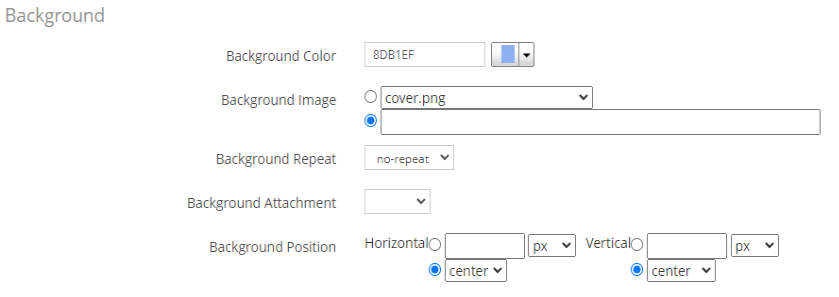 Figure 8. Background options for section style
The background-attachment option is entirely up to your preference. If you would like the image to just stay in place and scroll with the page, set it to scroll or leave it empty. If you would like the set a parallax background effect, set this option to "fixed".
For the background position option, this example will just be setting both to center. If you want to set custom options, switch the radios to the top horizontal and vertical options. You can set custom amounts and units here, but this is heavily dependent on your background-attachment, your image, and the display the user will see it on. If you, for example, have an image that has more of its content at the bottom you will want to adjust it so the background image slides up more.
The last thing that we have set is the minimum height setting which is set to match the image that is being used in the example. You can set this to whatever you are using or how large you want the section to be and adjust the background position as desired.
Note: you can just add headings by inserting media on the page customization but creating custom style sections allows you to repeat these with ease and it also lets you harness much more styling options which is really useful for things like margins and padding.
Step 2
Now we will need to begin the actual page customization, this should be relatively easy since the customizations have already been completed for the most part. For the sake of testing purposes, you can create a new category item in the course library, or choose what one you would like to edit. This example will be using the presentation of the tile, so change your presentation to tiles in the settings as outlined above and set your sorting and options to your desired output.
The example is going to be using a columned layout with a resource list for the courses. To begin you will want to click on the "Customize Page" Subtab under the content tab. This will open up the page editing options.
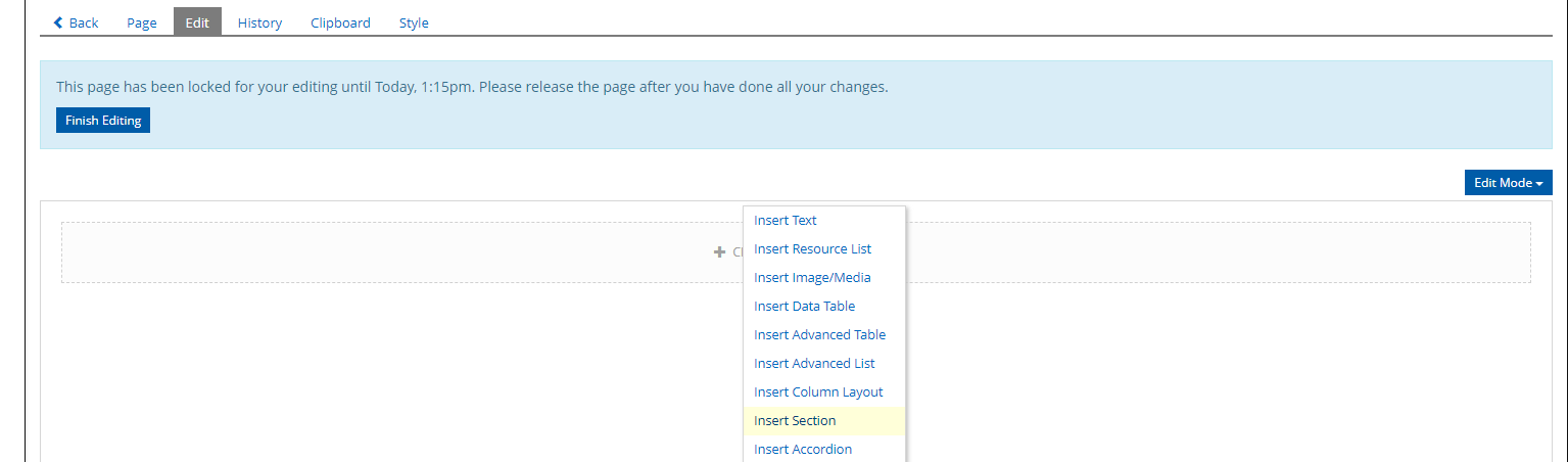 Figure 9. Page Customization options.
Let's add the header section we created earlier first. Click the outlined area and select "Insert Section". In the style class, click the drop-down and locate the name of your custom style class block. Save your changes and you should now see this section on the page. Next, we will add the columned layout for our text and resource list. For this, click the plus to get the addition options and click on "insert column layout". you will see several options for column layouts, this can be used for any responsive column layout based on a grid with 12 units per row. For this example, we are just going to be adding a two-column layout. The main and side block option is also useful for this application but we will be customizing the widths regardless. On the next view, you will see a column options table with Position, small, medium, large, and extra large. These sizes are referring to the screen breakpoint on your responsive design. So for the small option, we will be keeping 12/12 as this will set both columns to be full width on smaller screens like mobile views. This means your content won't appear smushed on those screen views. So the first column will be the smaller of the two. We will set this one to 5/12 for all the other options. For the second column, we need to just set the value to 7/12 so that when added they make 12 (7+5). you can set the columns to equal 12 or less than 12 (which will not cover the row 100% of the width). Save these settings and go back to the page. You see now see an area you can add objects into that is split into columns. So in the first section, let's add that test heading we made earlier.
 Figure 10. Customize page add options
Clicking "Insert Text" will; open a text box where you can begin adding your headline text in. On the left you will see some editor tools, this is where we will set out text to have the headline style we made earlier. Click on the paragraph drop down and find your custom style and select it. Once that has been applied, click save and return to create our next text box. This will be created by clicking insert text again but this time, we will apply the paragraph style we created to our text. Once this is to your liking, click save and return. We will now add our resource list to the next column.
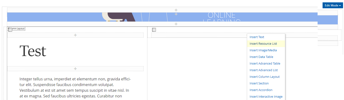 Figure 11. Insert the resource list
The resource list will show you a drop-down of the items within that course category. Select what resources you would like in this list and save. You could sort courses into categories and have those in separate resource lists for subject sorting as a use case. The resources will not appear in their tiled format until you finish editing and go back to the page view. You will now see your resource list in the column you added it. To add more customization, try adding some custom tile images. Under the resource (course, category, etc) go to the settings tab. You will see a section where you can upload a tile image for the resource.
You have now created a nice customized landing page for your course category. Now that you have some experience with customizing pages, feels free to tweak things to your liking or try out new layouts and styles.